Discount Summary
The car buying process is so competitive and shoppers are always looking to maximize discounts. Rodo needed to make sure its customers clearly saw all of the benefits of shopping through Rodo.
Shoppers were seeing vague information about the vehicle pricing, even though Rodo was automatically applying all discounts available. Shoppers were assuming that the discounts had not been applied. Consequently, when shoppers saw discounts on other merchants’ platforms, they thought those merchants had better deals.
The Rodo team also wanted to clearly communicate the benefit of shopping through Rodo.
Shoppers weren't sure if they were getting the best price possible, and often were unclear if any discounts were applied at all.
Image of Search Tile - Original
I was the lead Designer for this project. I collaborated with the Business Finance and Rebate teams.
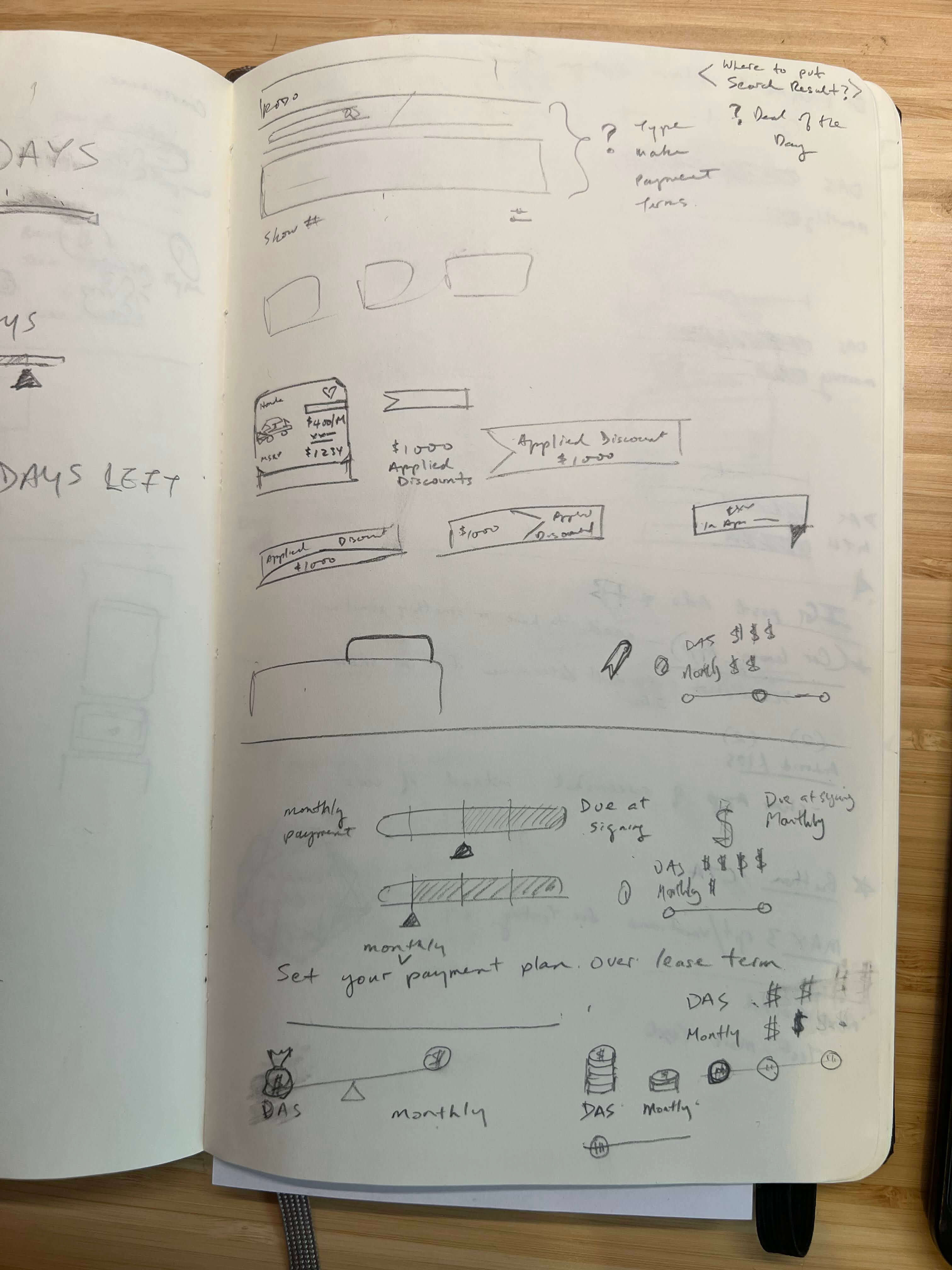
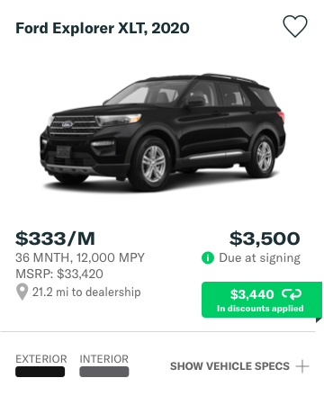
We knew we needed to show the shopper all of the discounts that were being applied to their purchase. For example, we needed to show the amount that’s due at signing. This ensures Rodo clearly emphasizes its value proposition of providing our customers with crystal clear pricing that has all discounts, taxes and fees bundled in.
During the design exercise, I noticed that the existing placement of the vehicle image was competing with other key information. I wanted to make sure things were sectioned off clearly for easy visual scanning.
Originally I needed to take the path of least resistance and add something that quickly showed the amount due at signing and the total discount that was applied:
Image of Search Tile 2 - After
However, I knew we wanted to show the specific discounts (which came from various sources). I began by sketching out a few early concepts:
Sketches for Discount Badge for Vehicle Tile
sketches of payment tiles
Sketches for Detailed Discount Summary
After sketching, I prepared a few versions of buttons and breakdown overlays for the team to evaluate:
Image of Search Tile - Option 1
Button Idea 1
Adding a link calling out “Show discount”s beneath the “Total Discount” ribbon while staying consistent with existing styles.
Image of Discount Tile - Option 1
Discounts Layout Idea 1
Expanding overlay breakdown of discounts on the current tile (consistent with existing styles).
Image of Search Tile - Option 2
Button Idea 2
Add an ‘expand’ button to the “Total discount” ribbon.
Image of Discount Tile - Option 2
Discounts Layout Idea 2
Updated style of overlay introducing a new style that shows total discount.
Image of Search Tile - Option 3
Button Idea 3
Add a ‘flip’ button to the ribbon. The suggested icon is clearer to reflects a `flipping` animation.
Image of Discount Tile - Option 3
Discounts Layout Idea 3
Separating out the discount breakdown to be its own container with clearer dividers.
After discussing with the team, we landed on a solution that  provides as an easy way for the shopper to consume the discount information. I focused on copy that would be more easily digestible and also colors that matched our brand but was also readable.
Image of Search Tile - Released
Production Version of the Button
Image of Discount Tile - Released
Production Version of the Discounts Layout
This was a great project to show the team how investing in design and feedback allows for quick iteration and saves developer resources.
During the design process, I’ve learned to be careful not to overuse brand colors (green as a background color), since it can become very distracting on screen making it hard to read the itemized text.